
The College Rebranding Epidemic
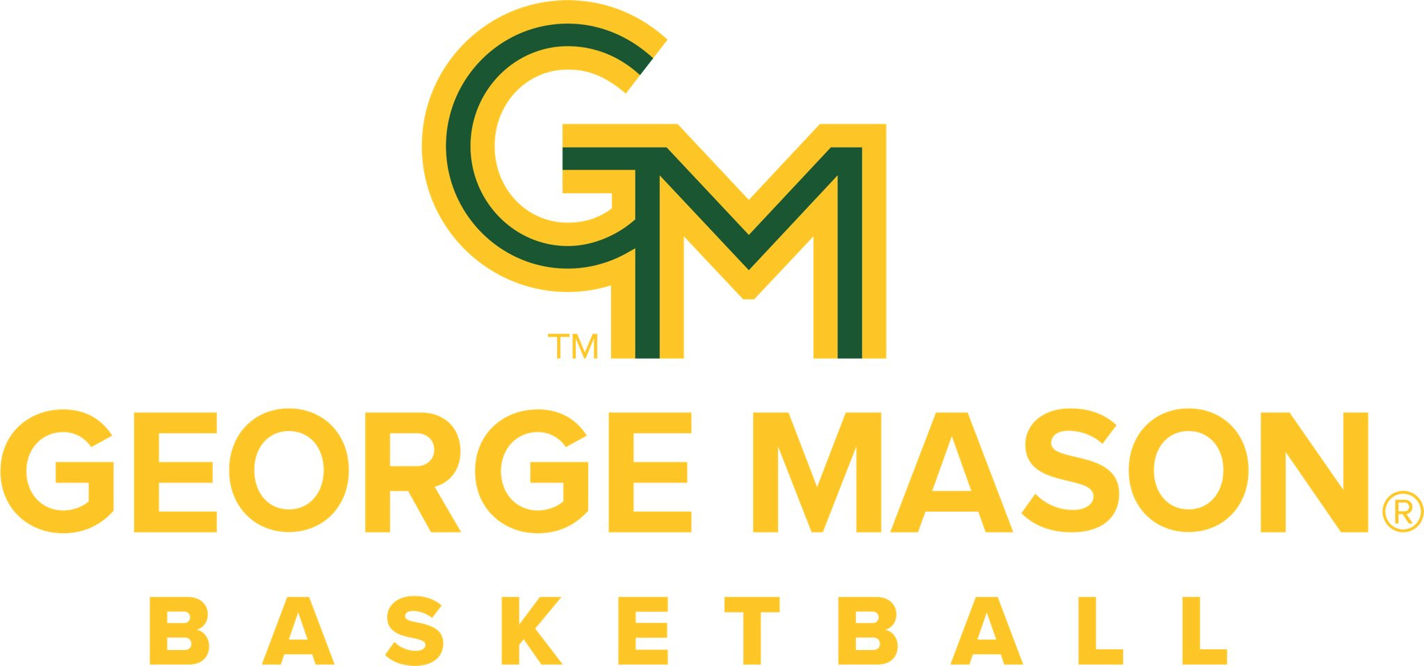
George Mason unveiled their new logo and faced criticism across the internet. The transition to lifeless basic branding is sucking the life out of colleges' recognition.

We are stepping back from talking about the transfer portal and coaching carousel in this one to discuss a topic that is very relevant for George Mason fans right now. College rebrands are going horrendously right now.
Recently, George Mason unveiled what their new logo would look like…it is awful.
This has been the latest update in a recent trend where schools are updating their longtime logos to something more “simplistic” in there eyes. Below, you will see Vanderbilt, Western Michigan, Akron, and George Mason’s recent transitions to static letters.
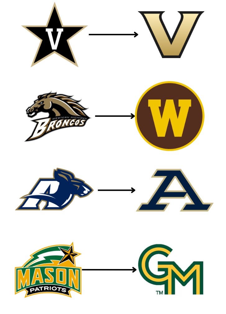
Those are just four samples, but more schools have continued to rebrand to these basic logos with their school letters rather than their traditional logos. This is something that’s often faced backlash from fanbases. Vanderbilt went under heavy fire for their transition to what is now just…a giant gold V? Akron took out an incredible Kangaroo to just go with…a giant A? Western Michigan apparently wanted to just copy the Washington Commanders. George Mason decided to pay thousands to a middle schooler with a free Canva account to do theirs.
Looking at Akron, this was a quote from Director of Intercollegiate Athletics Charles Guthrie, "This new approach simplifies and aligns our identity across all settings, makes a statement about who we are, and will increase the impact of the Akron Athletics brand."
This was a quote from George Mason President Gregory Washington: “Higher education in America is at an inflection point, with families having a harder time finding a top-quality, affordable college education at a university that will actually admit them. George Mason has always offered these things, but few families know of this value because our brand and message have not been adequately heard. This new look is our reintroduction to the community, and a symbol of our commitment to the fundamentals: outstanding and rigorous academics, pragmatic career preparation and internships, flexibility and value, and an atmosphere of belonging for everyone.”
I don’t even understand what Gregory Washington was trying to say here. You can read their full press release here, but it’s just baffling because he seemingly just rambled a bunch. At least Charles Guthrie was stating this was to “simplify their identify”. While I disagree with their move, at least that was justified. George Mason can’t even seem to justify their transition.
Students are so upset over the transition that they started a movement called “Students Against Logo Tragedy”. You can read more about their claims in this article, but it’s worthwhile noting that complaints from these transitions are often met with student opposition. Had George Mason unveiled the best logo in college sports, there would’ve been opposition, but the fact that it was this plain and generic makes their position worse. To the students’ point, why waste funds on something that is just lifeless?
I want to end this with a reminder, this is a pure opinion piece however it’s hard to justify these transitions. I beg these universities to stop paying tens or even hundreds of thousands of dollar for rebrands that remind their fans and outsiders of what a terrible decision it was.
Use the code “BracketBusters” when checking out at Crow’s Nest Coffee Roasters to receive 10% of your order!
None of those new logos are an upgrade. Not even close.
Back in 2010 Michigan State had plans with Nike to redo the Spartan helmet logo. Someone on the main MSU message board found it before was announced by browsing the US patent office website and immediately posted it on the board. Thankfully the fan outcry was enough that it forced MSU to keep the logo the same.
Glad someone else is seeing this and got a piece out on it. I was just around Davidson College the other day who made a similar move - trading in an iconic logo for a really *normal* one. Nice work